Well, I’ve now finished my short run of breakfast seminars on converting website visitors into customers, but I’m pleased to say that from April, there will be a full day workshop available. I promised in a previous post that I would write more about conversion and I thought I’d start with something really simple.
I’m running a test for a client that is simply testing the best wording and placement of a call to action, essentially “click here to make an enquiry”. Previously, the call to action was quite small and not very commanding (a link that started “Request more information…”), so I’ve created a few combinations of text and an email graphic to see what works best. That’s all – no fancy images, no major changes to page layout, just different text and an extra email icon.
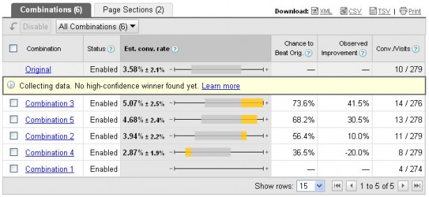
These are the results:

As you can see, although the test is still running, we’re looking at an increase of over 41% with the best combo, from the original’s 3.58% conversion rate up to 5.07%, pretty much an extra 1.5%. That’s just from re-wording the link to the enquiry form!
Goes to show how even the simplest things can significantly affect conversion rates.
